UI Design Course on Figma


Timeline
2023
Company
Dribbble
Role
UI/UX Design
Tools
Figma, Illustrator, Photoshop
Deliverables
High-fidelity app screens, UI library, functional Figma prototype
Project Overview
In 2023 I enrolled in Dribbble's Intro to UI Design course to strengthen my understanding of product design. My background is rooted in motion, but the graphics designer in me has always been drawn to how great interfaces can feel intentional, intuitive, and quietly delightful. This course ended up being more than a learning experience. It changed how I think about people, interaction, and the experiences design creates.
For the final project, the brief was Moon, a fictional startup reimagining the NFT marketplace with a design-first, curated approach. Over three weeks I developed a visual identity, designed a multi-screen app, built a complete UI library, and delivered a functional Figma prototype.
The Challenge
The brief for Moon was challenging, establish a visual language for a new NFT marketplace, scale it across key screens, and deliver a prototype that felt polished and purposeful. But the real challenge wasn't making something that looked good, it was learning to think like a product designer.
As someone fairly new to UI/UX at the time, the hardest shift was moving from "does this look good" to "is this a good experience." I wanted the app to feel desirable, something people could actually use, not just admire. That meant learning the logic behind navigation, building flows that made sense, and designing interactions with real intention behind them.
My Role & Collaboration
This was a solo project completed within the course timeline, with full ownership of every design decision from concept to prototype. Concept exploration, visual direction, screen design, the UI system, the component library, interaction design, and the final Figma prototype, all mine.
Even working solo, I shared work-in-progress screens with coworkers who had product design backgrounds. Their feedback, mostly around UX clarity, helped sharpen the direction and made sure the final result wasn't just visually appealing, but actually practical.
The Process
Discovery & Inspiration
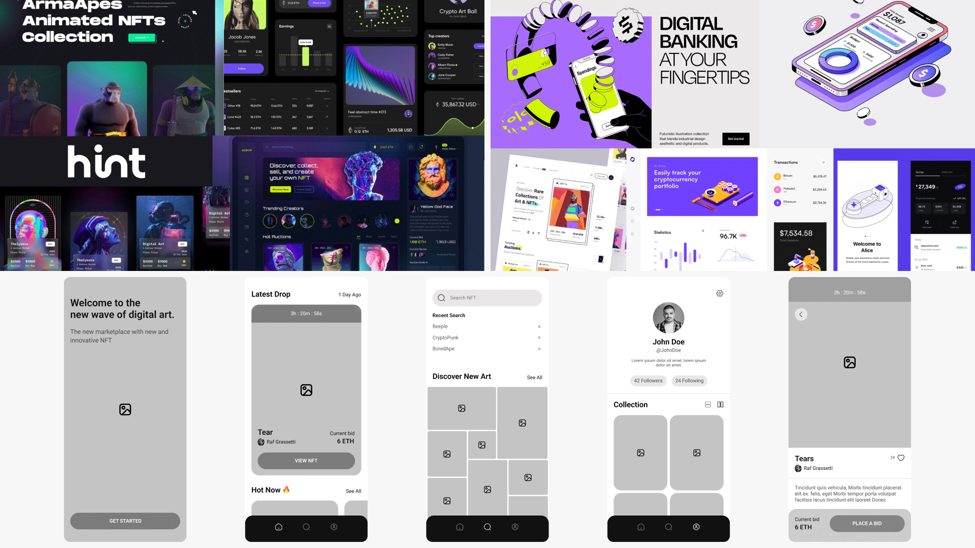
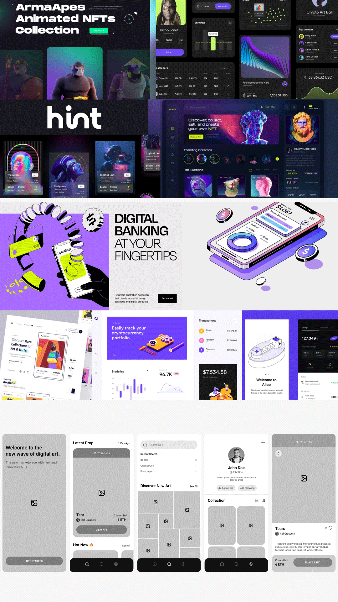
The project started with research centered on one keyword, NFTs. From there I built moodboards that pulled the direction into two separate concepts.
Concept 1 leaned dark, gradient-driven, and modern, with bright accents and a sci-fi vibe. Concept 2 went lighter, with outlined iconography, pixel-inspired details, and bolder, more playful typography. Both trying to speak to the same crypto-savvy, digital-art audience, but carrying completely different moods. Keeping the explorations intentionally distinct meant the final direction would have a clear, cohesive identity, not a blend of ideas pulling in different directions or feeling like too much at once.
Workflow & Tools
After reviewing both concepts, the dark direction became the clear winner. It aligned more naturally with crypto culture, gave better contrast for showcasing artwork, and delivered the sleek, tech-forward feel the brief called for.
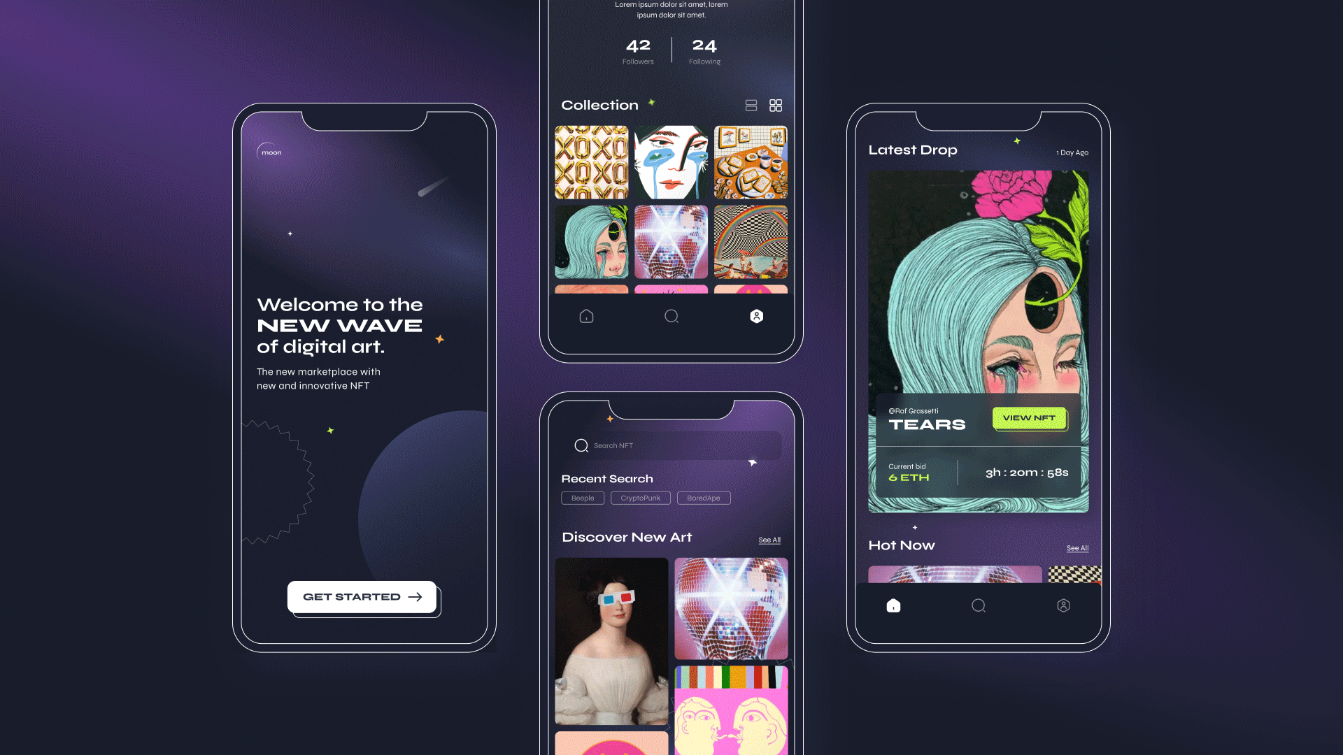
From there I scaled the visual system across five core screens, reorganizing layout and flow from the original wireframes where needed: splash, home, profile, search, and the NFT detail page. This was the stage where the app started feeling real rather than conceptual.
Building the UI library came next, and it ended up being one of the parts I enjoyed most. Color palette, typography hierarchy, buttons, cards, icons and states, all documented so the system could scale cleanly. It was my first time building a full design system from scratch, and there's something deeply satisfying about everything being organized, reusable, and ready to extend.
All of it lived in Figma, using auto layout for scalable variations, component variants, and smart animate for the micro-interactions in the prototype. I also used a Figma plugin to generate avatars that felt aligned with digital artists, and pulled reference illustrations from Pinterest to make the screens feel populated and alive.
Tools: Figma
Iteration & Feedback
Even as a solo project, I regularly shared work with coworkers to test clarity, hierarchy, and flow. Most of the feedback centered on UX, small adjustments that made the app easier to navigate and interact with.
I also spent time exploring interaction animations throughout the prototype, button feedback, screen transitions, subtle movement that made the experience feel more engaging without getting in the way. That part came naturally given my motion background, but applying it inside a UX context rather than a purely visual one was a new kind of thinking.
AI Integration


The Solution
The final result is a clean, modern NFT marketplace concept that blends visual clarity with a tech-forward aesthetic. The dark theme makes the artwork the focal point, the layout keeps navigation intuitive, and the interactions add a sense of polish without slowing anything down.
The prototype brings it all together, showing how someone would actually move through the app and interact with its key features.
Impact
This project completely changed how I think as a designer. It sharpened my visual precision, improved my attention to consistency, gave me a real foundation in UX fundamentals and user-centered thinking, and made me significantly more confident in Figma. Building a complete design system from scratch taught me to think in components rather than one-off screens, and that habit has stuck with me ever since.
Shortly after, I started using Figma not just for web design at Aceable, but for multi-ratio social assets too. Auto layout turned out to be a small miracle for dynamic design work.
Most importantly, this course changed how I see the people on the other end of my work. Not just viewers, but users. That perspective has shaped everything I create since, from motion to interfaces.
Reflection
This project was never really about becoming a product designer. It was about becoming a more thoughtful, versatile creative. Learning UI fundamentals gave me a new lens for thinking about experience, interaction, and intention, and it made me better at the work I was already doing, not just at a new discipline.
It also reminded me how much I love learning. New tools, new skills, anything that expands the ways I can tell a story through design.