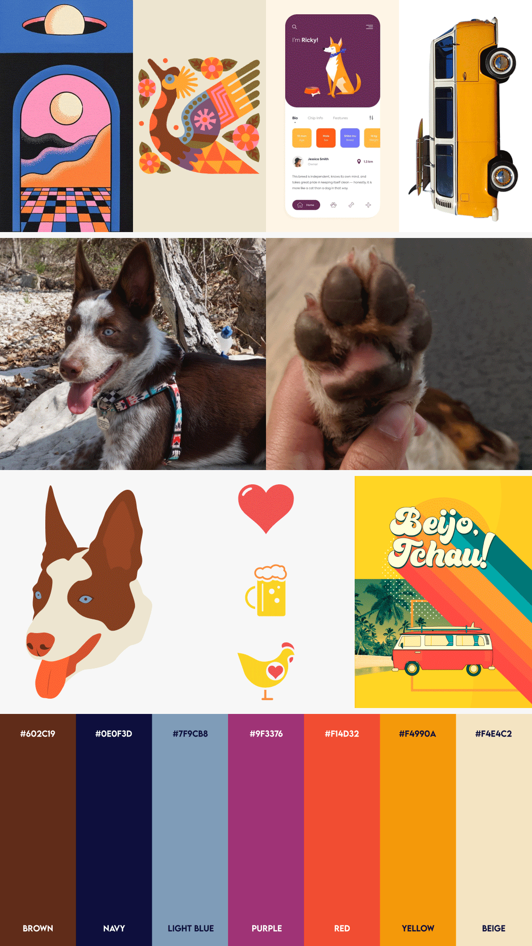
Skateboard Deck Series
Timeline
2020
Company
Personal Project
Role
Art Direction, Illustration, Graphics Design
Tools
Illustrator
Deliverables
Three-piece set of fully illustrated skateboard decks
Project Overview
I set out to create something purely for myself, a small design series that brought together the things I love most: skateboarding, bold colors, Brazilian culture, and my dog Queso.
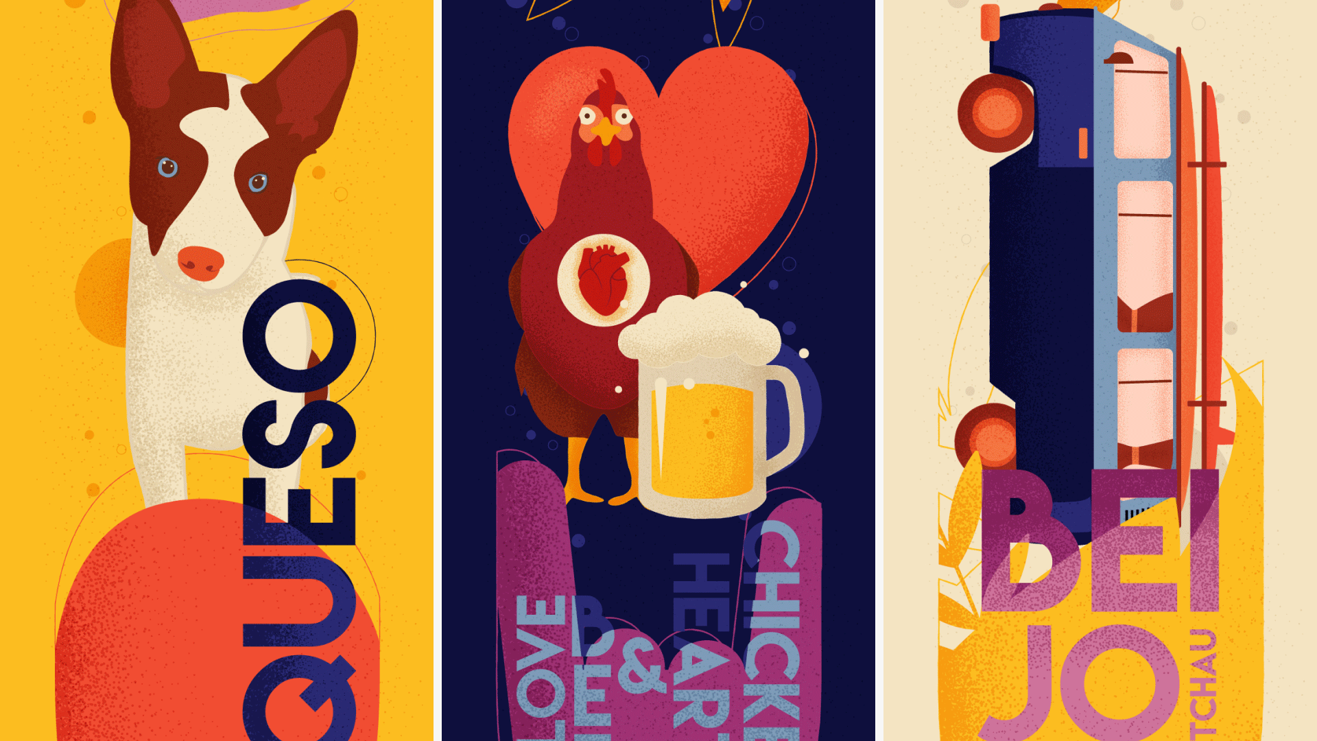
Three custom skateboard decks, each themed around a piece of my life:
Queso, a board dedicated to our dog, the true ruler of the house. Love, Beer & Chicken Hearts, a very Brazilian combination and one of our favorite comfort foods. And Beijo Tchau, a tribute to travel, distance, and the sentimental way us Brazilians say goodbye.
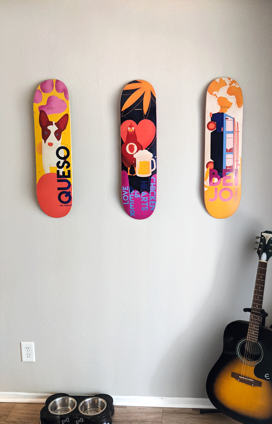
The final boards were printed and now live as wall art in our home, a colorful piece of who I am and one of my favorite things I've ever made.
The Challenge
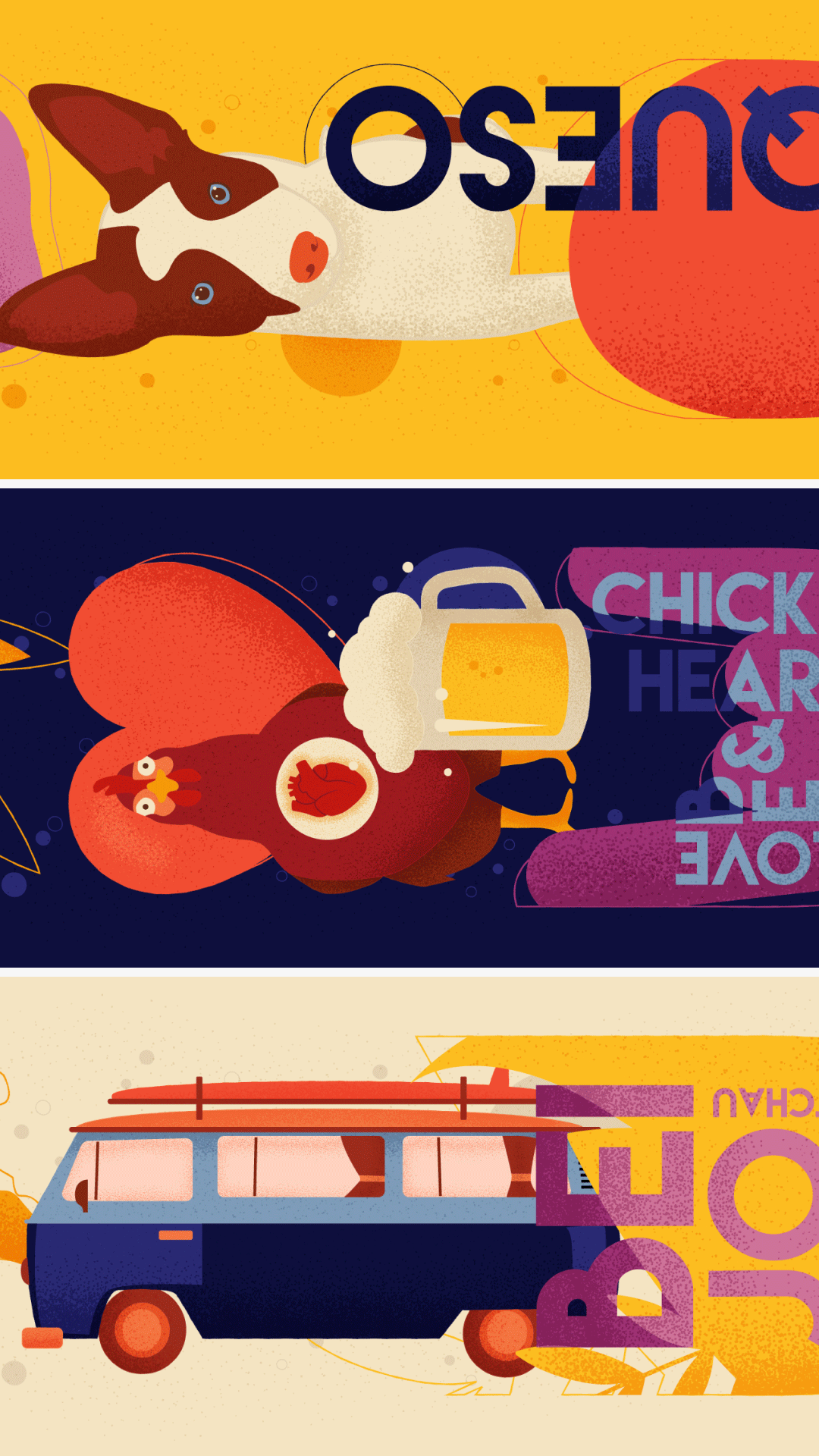
Because this was a fully self-directed exploration, the biggest challenge was designing boards that felt cohesive, expressive, and polished without becoming overly busy. Skate decks have a tall, narrow format, so compositions had to flow naturally while maintaining visual balance.
I also wanted each board to feel personal and meaningful on its own while still reading as a unified series. Three very different themes, one visual language holding them together.
My Role & Collaboration
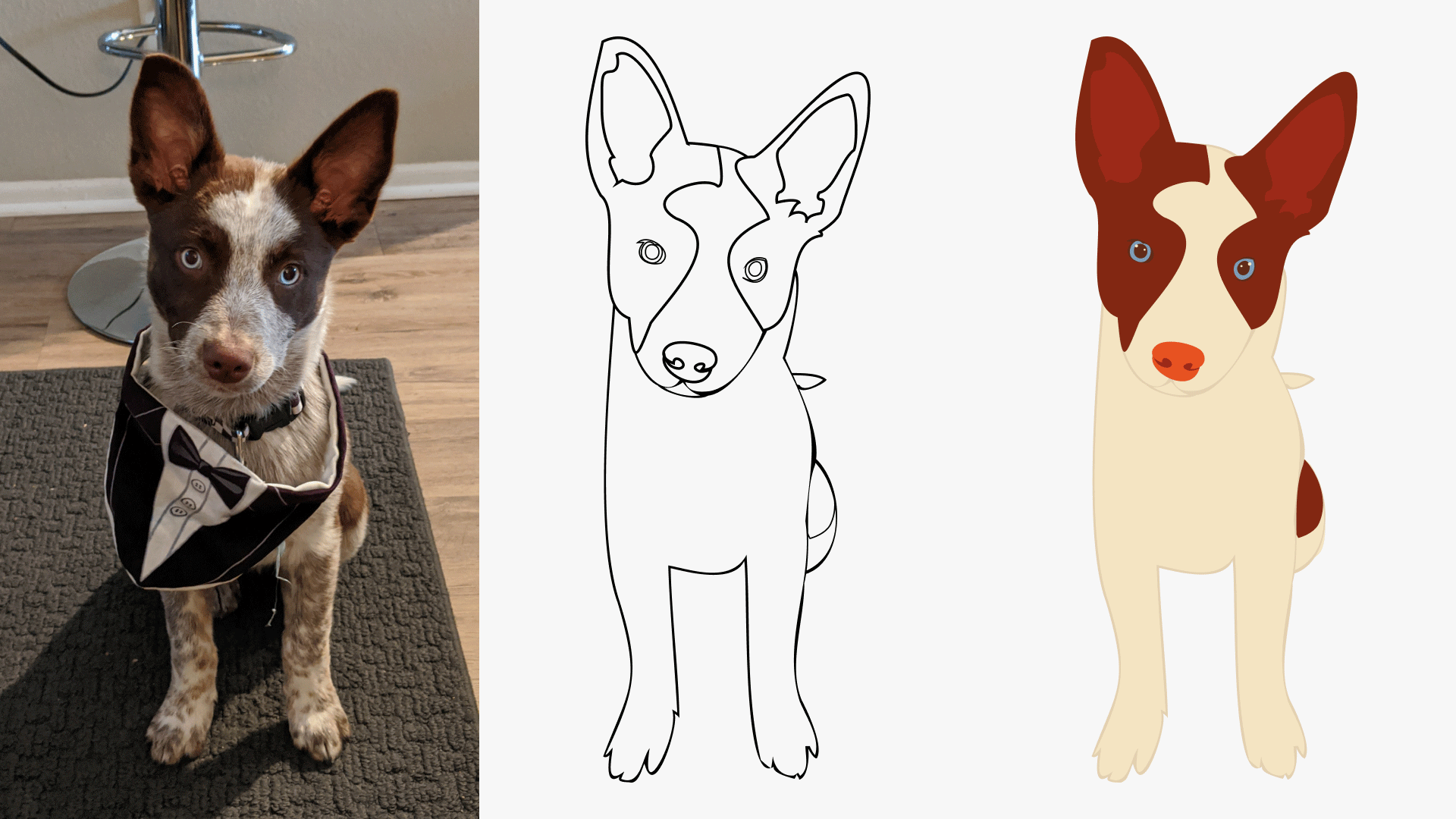
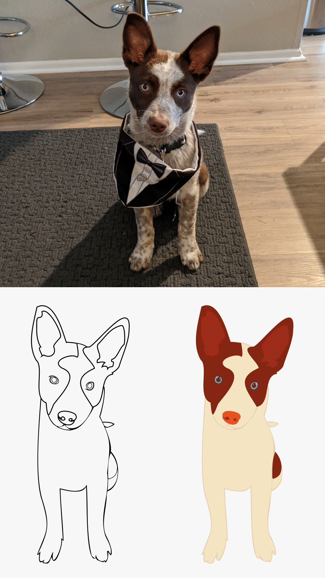
This was a completely solo project, illustration, design, layout, color, and production. My only collaborator was Queso, who posed for reference photos.
The Process
Discovery & Inspiration
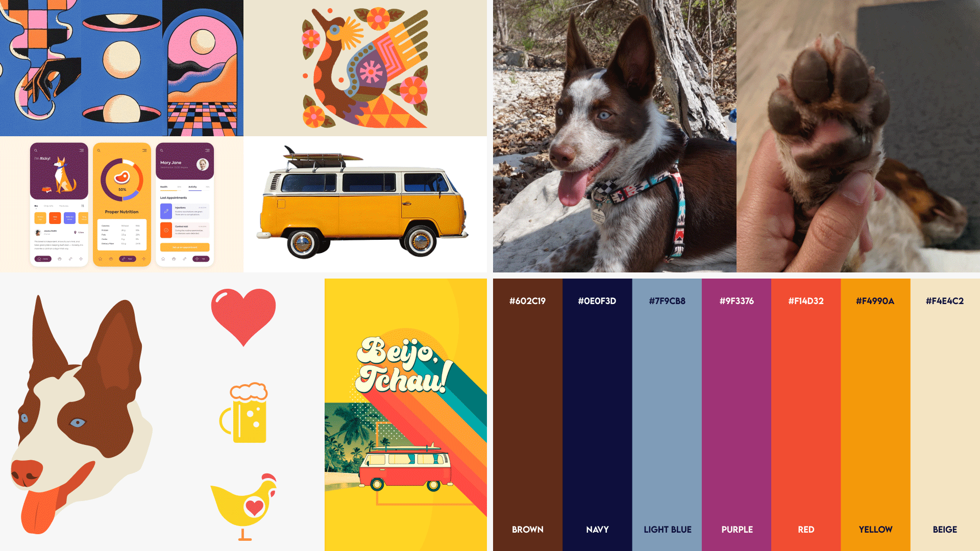
I pulled visual references from Pinterest, leaning toward bold, contrasty color palettes, organic shapes, and playful illustrative styles. I knew I wanted textures and splatter details to keep everything from feeling too flat, and I wanted each board to have a strong meaning rooted in something personal.
The three themes reflect different times of my life:
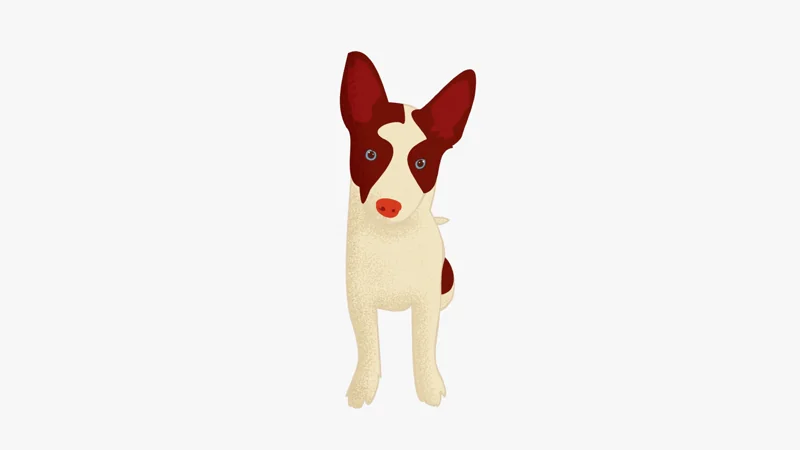
Queso: the present. He's the heart of our home and the little soul that made us feel like a real family. Getting him right after we got married changed our whole life dynamic for the better, he's part of everything we do, every plan.
Beer + Chicken Hearts: the past. A playful love letter to Brazil and the way we celebrate. Barbecue with chicken hearts, beer, laughter and love are part of my culture and always will be. Comfort, joy, and roots I carry with me everywhere.
Beijo, Tchau: the future. Me and my husband met when I lived in Brazil and he was working overseas, so for the first two years of our relationship we were basically distance dating, meeting for vacations in different countries. "Beijo, tchau" is what you say in Brazil before setting off on an adventure, and for us it meant see you again soon. This board is a tribute to that chapter and to all the stories we still want to create.
Workflow & Tools
The boards were illustrated in Adobe Illustrator, starting with rough sketches and then refining each composition around the curved deck silhouette.
I drew Queso by hand from a favorite reference photo, keeping the lines expressive rather than perfectly clean. From there each board got its own treatment: expressive lines, splatter textures for depth and movement, and organic shapes filling empty areas for balance. Every composition was extended into bleed and prepared using the manufacturer's layout template for printing.
Tools: Adobe Illustrator
Iteration & Feedback
Because this was entirely personal, I didn't share early drafts with anyone but my husband, who is not a designer by any means. That actually ended up being incredibly freeing. I refined each deck by trusting my own instincts, rearranging elements, adjusting colors, and imagining how the artwork would look if someone actually rode it.
No external feedback, just me and the work until it felt right.
AI Integration
The Solution
Three bold, colorful skateboard decks with expressive illustration, high-contrast palettes, and motifs rooted in my life and culture.
Even though they were designed as art pieces, I approached each board as if it were meant to be ridden, flowing compositions, balanced spacing, and elements oriented to look good in motion. They were printed on high-quality decks and now hang as wall art in our home, a little visual signature that shows up behind me on video calls. People always ask about them.
Impact
These boards are some of the designs I'm proudest of. They started as a way to stay inspired and creative during a slow period, and ended up becoming some of the most expressive work I've ever made. It's awesome how personal projects always have a way of doing that.
Reflection
This project reminded me how refreshing it is to create with no external expectations. No brief, no client, no deadline except the one I set for myself. Just illustration, color, and the things I love most.
It also reconnected me with how much I enjoy illustration as a discipline on its own, separate from motion or marketing or anything else. Sometimes you need a project like this to remember why you started.