Caru – Do Outono


Timeline
2020
Company
Caru
Role
Concept, Illustration, Graphics Design, Motion Design
Tools
Hand-drawing, Illustrator, After Effects
Deliverables
Animated music video, social media assets (covers, posts & GIFs)
Project Overview
Do Outono is an animated music video created for Caru, a Brazilian MPB artist known for her warm, melancholic sound. She came to me with a simple, open brief: visually interpret her new song through animation. No strict guidelines, just a release deadline and full creative trust.
The song's title means "Of Fall (Autumn)," and everything followed from there, the warm palette, the falling leaves, the light that moves through scenes like it's revealing something rather than just illuminating it. Over two to three weeks I led the full creative process from concept and hand-drawn storyboards through illustration, animation, and delivery.
It was the first fully animated music video Caru had, and the beginning of a creative partnership that's still going. She's now about to release a new album and I'll be creating the full visual identity for it.
The Challenge
Full creative freedom sounds ideal, but it comes with its own pressure. Without guardrails, every decision has to come from somewhere intentional, and with a song this poetic, the biggest risk was either becoming too literal or too abstract.
The lyrics describe fall light reflecting off a lover's brown eyes. That's a delicate, specific image. Translating it into a two to three minute visual experience without illustrating it too literally, or losing the emotional thread entirely, required a clear visual logic that could carry the whole piece.
The other challenge was keeping the visuals feeling alive and non-repetitive across the full runtime. Abstract animation can easily start looping the same ideas. Every scene needed to feel connected to the ones around it while still moving the emotional journey forward.
My Role & Collaboration
This one was entirely mine. Concept, storyboards, illustration, animation, texture treatment, compositing, and the social media deliverables. I handled everything from the first sketch to the final export.
Caru reviewed and approved key stages along the way, the storyboard, the design, and the animation, but otherwise trusted my direction completely. That kind of creative trust is rare and I don't take it lightly. It also means there's nowhere to hide if something doesn't work, which has a way of making you more intentional about every decision.
The Process
Discovery & Inspiration
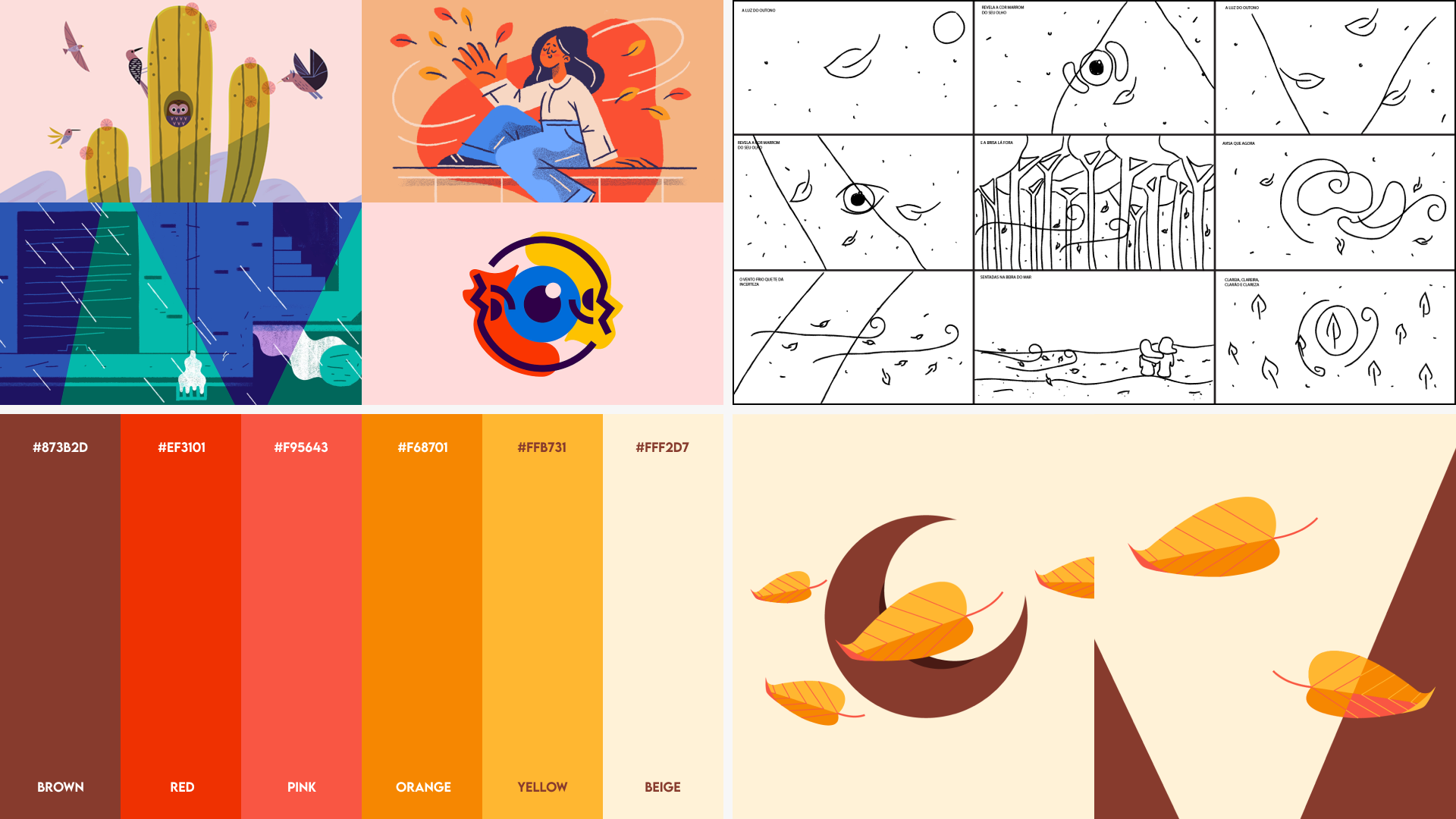
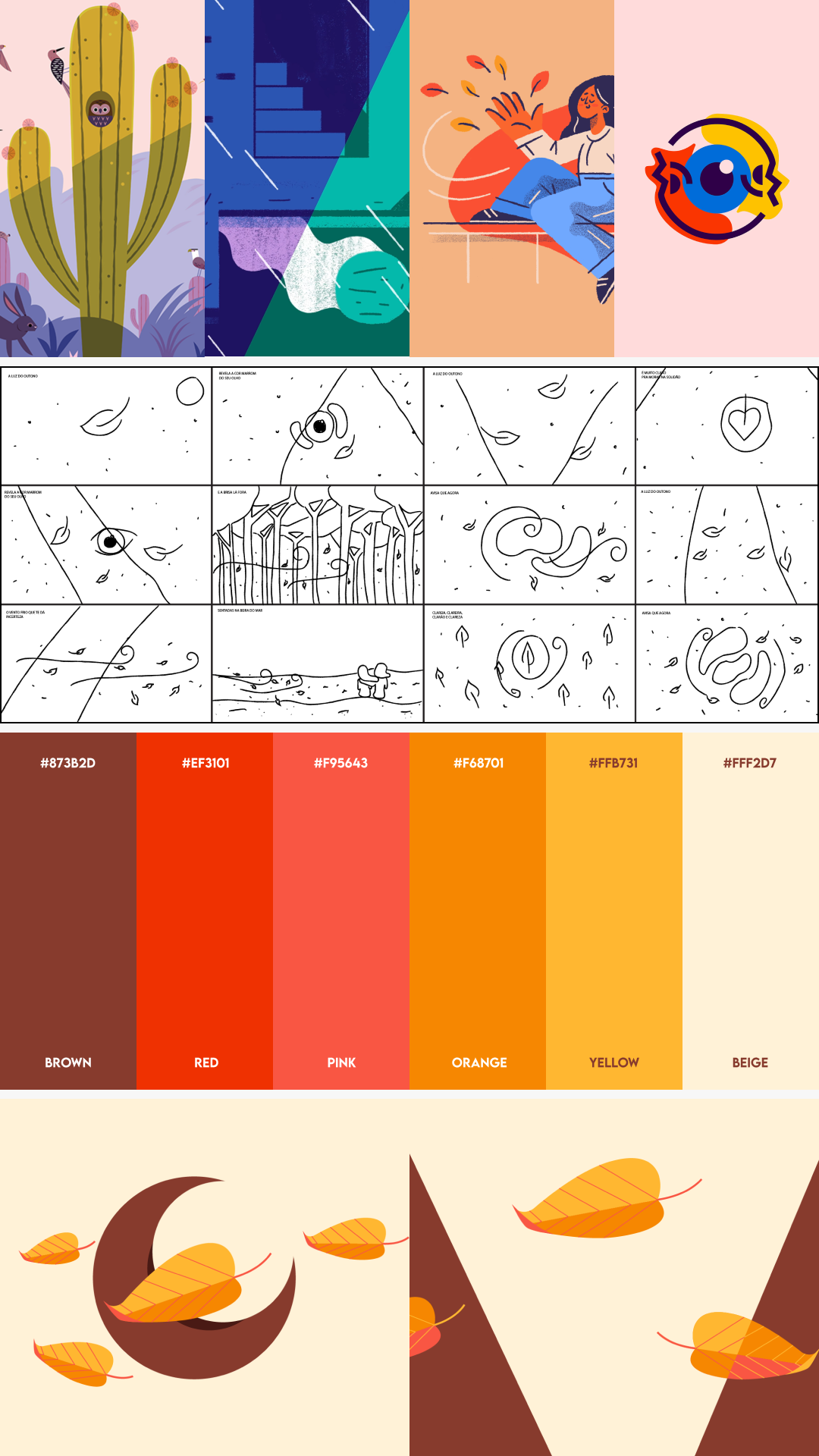
The song's title and lyrics gave me everything I needed to start. "Do Outono" pointed directly to a warm, melancholic palette, constant gentle movement, and the kind of light that feels like it's fading rather than arriving.
What shaped the visual language more specifically was the contrast I kept finding in the music itself. The guitar is incisive and rhythmic, but Caru's voice is smooth and unhurried. That tension between precision and softness became the organizing principle behind every visual decision. The illustrations are slightly asymmetrical trying to achieve symmetry. The eye is perfectly round but the texture makes the lines a little wobbly. The light moves in an odd pendulum swing, like falling leaves that can't quite decide where to land.
I drew the storyboards by hand first, and when I translated them into vectors I kept those imperfect, asymmetrical lines on purpose. That handcrafted quality running through a digitally precise piece felt like the right visual equivalent of what the song was doing sonically.
Workflow & Tools
The process started with hand-drawn storyboards that mapped out the pacing, visual beats, and transitions tied to the music. Getting the rhythm right on paper before touching the software saved a lot of time and kept the animation grounded in the emotional arc of the song rather than the technical possibilities.
From there I moved into Illustrator to clean up the storyboard sketches and build out the full color palette, delivering the designs to Caru for approval before any animation started.
Animation happened in After Effects, with timing synced closely to the beat. The textures were built using layered subtle noise to evoke wind-blown dust, nothing was static, everything should feel alive. Light became a color-shifting mask that moved through key scenes, revealing and obscuring forms the same way the lyrics describe it doing to her lover's eyes.
Tools: Adobe Illustrator, Adobe After Effects
Iteration & Feedback
Because the creative direction was open from the start, feedback was less about changing things and more about calibrating them. The main questions throughout were about emotional tone rather than structure. "Does this scene feel fresh or is it repeating something we've already see? Does the texture feel alive or is it becoming noise? Is the transition earning its place or just filling time?"
Those are harder questions to answer than "change this color" or "move this element," but they pushed the work further than a more prescriptive brief would have. The final animation evolved through careful pacing and refinement rather than dramatic structural changes. When the feedback is mostly about feeling, you know you're in the right path.
AI Integration
The Solution

The final video is a poetic interpretation of Do Outono, built from warm seasonal tones, flowing textures, and gentle rhythmic animation. Light moves through every scene as a storytelling tool, shifting colors and revealing forms the way the lyrics describe it catching in someone's eyes.
Every element earns its place. Falling leaves, drifting dust, pendulum swings, kaleidoscope symmetry emerging from asymmetrical shapes, nothing is decorative for its own sake. Each visual choice connects back to something in the music, the melody, the lyrics, or the emotional atmosphere of the song.
The result is something that feels handcrafted and immersive, like the song itself decided what it wanted to look like.
Impact
Do Outono reached Caru's audience across YouTube, Instagram, and Spotify, and the response was immediate. Fans connected with the visuals, and Caru continues to reshare the animation years later, which says more about how it landed than any metric could.
The project also marked the beginning of an ongoing creative partnership. Caru is now preparing to release a new album, and I'll be creating the full visual identity for it. That kind of trust doesn't come from one good delivery, it builds over time.
Reflection
Do Outono remains one of the most meaningful projects I've ever worked on. It came during a personally challenging time, and having a project that asked me to slow down, observe, and make something purely expressive was exactly what I needed.
It taught me how to tell stories visually without relying on literal imagery, how to build emotion through texture and light, and what it actually feels like to lead a creative project from the first sketch to the final frame with complete ownership. That confidence carried into everything I made after it.