Aceable


Timeline
2021-2022
Company
Aceabe
Role
Graphics Design, Motion Design
Tools
Illustrator, After Effects, Premiere Pro, Audition, hand-drawn illustration
Deliverables
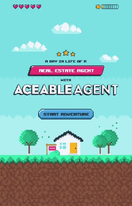
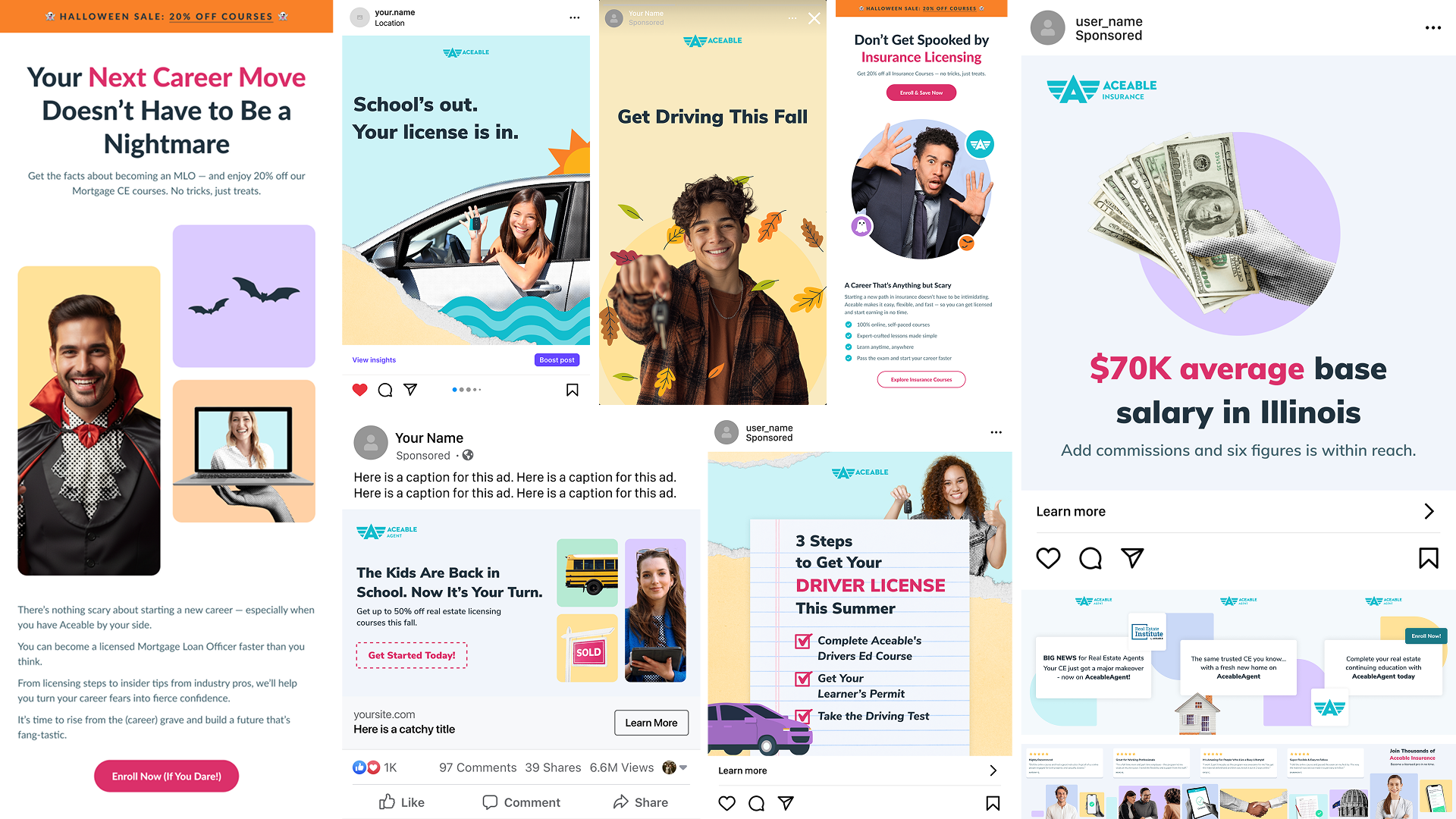
Social media animations, email visuals, marketing videos, seasonal campaigns
Project Overview
When I joined Aceable in 2021, the company was rapidly expanding its family of brands, which today includes Aceable, AceableAgent, PrepAgent, Aceable Insurance, Aceable Mortgage, DriversEd.com, and I Drive Safely. As the first full-time motion designer on the marketing team, I supported creative needs across all verticals and brands producing videos, animations, and graphics that helped unify visual language and bring consistency to our multi-brand ecosystem. As new acquisitions emerged, like PrepAgent and later Real Estate Institute (which evolved into Aceable Insurance and Aceable Mortgage), the challenge became blending visual styles and ensuring these brands aligned with Aceable’s evolving identity.
The Challenge
Aceable’s marketing team was growing quickly, but there wasn’t yet a cohesive visual language connecting all of its creative outputs. Without a clear style guide or established tone, each campaign risked feeling disconnected. The goal was to create engaging, polished content that reflected Aceable’s upbeat energy while laying the groundwork for a consistent motion identity the company could build on.
My Role & Collaboration
As the sole designer on the marketing side at that time, I worked closely with the marketing steak holders to develop visuals for animated social posts and email campaigns. The team provided briefs and creative goals, while I handled every step of the process, from concept development and illustration to animation, editing, and sound design.
It was an open, experimental phase with plenty of creative freedom, where I could define the brand’s early look and feel through motion.


The Process
Discovery & Inspiration
To establish a starting point, I referenced the Learning Experience (LX) team’s existing icon library, which featured flat illustrations and a clean color system used in course content. I simplified the palette further, highlighting the primary brand color as a hero hue, and began creating motion pieces that felt bold and friendly.
Workflow & Tools
Since there were no templates or brand assets to rely on, I built everything from scratch. Each campaign started with hand-drawn storyboards and quick sketches to explore rhythm and composition, followed by illustration, animation in After Effects, and final editing and sound design in Premiere and Audition.
Iteration & Feedback
At that stage, there wasn’t yet a structured feedback culture around design consistency, so I often relied on intuition and the brand’s voice tone to ensure visuals matched the company’s personality. With each campaign, the creative direction became clearer, and Aceable’s visual language started to take shape.
AI Integration


The Solution
Through iterative experimentation and seasonal campaign work, I established the foundation of Aceable’s motion identity, a clean, colorful, and personality-driven style that could flex to different themes. Themed holiday campaigns became a playground for visual storytelling, allowing the brand to explore tone variations while remaining cohesive.


Impact
Across Aceable’s multi-brand landscape, from Aceable and AceableAgent to PrepAgent, DriversEd.com, and I Drive Safely, my work helped build visual cohesion during major brand shifts and acquisitions. The mixed media style, holiday campaigns, and ongoing motion systems became reusable foundations for teams across the company, strengthening brand consistency and enabling faster creative production.
Reflection
This period at Aceable was a turning point in my career, an opportunity to build something from the ground up. It taught me how to balance creative exploration with brand-building discipline and showed me the impact of consistency in shaping a company’s visual identity over time.