Mixed Media Brand Style

Timeline
2022-Now
Company
Aceable
Role
Graphics Design, Motion Design, AI Generative Design
Tools
Photoshop, Illustrator, After Effects, Audition, MidJourney, Nano Banana
Deliverables
Promo videos, website visuals, paid and organic social media assets
Project Overview

In 2022, Aceable's marketing team asked for a new promotional video for the Real Estate course. It began as a single project, but it quickly became an opportunity to define something the brand had been missing: a visual language of its own.
Aceable already had clear brand colors and typography, but no distinctive style for marketing content. Together with another motion designer, we developed a mixed-media approach that combined photography, vector graphics, and motion into something flexible, engaging, and unmistakably Aceable. That first video set the direction for everything that came next.
The Challenge
As Aceable expanded its media presence, the lack of a clear visual identity became more noticeable. Marketing assets across different channels felt disconnected and didn't fully reflect the brand's playful, accessible personality.
The goal was to create a visual style that could make Aceable stand out in the e-learning space while being flexible enough to scale across multiple formats, platforms, and course verticals. It also needed to be efficient enough for a small team to execute consistently without becoming a bottleneck.
My Role & Collaboration
This project started as a collaboration. Another motion designer and I developed the visual direction together. After an initial brainstorming session where we both gravitated toward collage-style visuals, he created the first storyboards while I helped refine the direction and visual language. We split the animation work for the first promotional video, and he handled sound design and final delivery.
From there, the mixed-media approach became a shared toolkit for the team. Depending on the project, we would either collaborate or take ownership of different pieces while keeping the same visual system intact. Over time our work diverged naturally, with him focused on in-app content and me expanding the style across marketing channels, sales campaigns, landing pages, and social content.
The Process
Discovery & Inspiration
We initially explored a fully illustrated style but quickly ruled it out. It would have required more time and specialization than our small team could sustain consistently.
Collage and mixed media stood out as the better path. It let us combine photography, vector graphics, and playful compositions into something visually distinctive while staying efficient to produce. The style had enough flexibility to work across very different formats and verticals without losing its identity.
The other thing that shaped the direction early on was observing what was already out there. A lot of e-learning brands leaned on stiff, corporate illustration or generic stock photography. Going mixed-media immediately set Aceable apart visually, and that contrast made the choice feel obvious once we saw it side by side.
Workflow & Tools
The style lives at the intersection of three things: photography, vector graphics, and motion, so the workflow had to support all three working together seamlessly.
Assets were built in Illustrator and composited in Photoshop, where photo editing, cutouts, and layering happened before anything moved. After Effects handled all animation, with Premiere Pro and Audition brought in for final assembly and sound.
As the style matured, stock photography started feeling repetitive and limiting. Image generation tools were becoming genuinely usable, so I started incorporating them as an alternative way to get photo variations, primarily AI image generators and Photoshop's generative fill, to create more unique characters and scenarios that fit the brand without pulling from the same image libraries everyone else was using. It kept the visuals feeling fresh without changing the workflow in any significant way.
Tools: After Effects, Illustrator, Photoshop, Premiere Pro, Audition, Generative AI
Iteration & Feedback
Throughout development, we explored a few visual directions before presenting options to the marketing team. The mixed-media approach stood out immediately for its energy, flexibility, and production efficiency, but we didn't arrive there on the first try.
After the first promo video launched, the style kept evolving with every new project. Each campaign, format, and vertical brought new constraints that helped sharpen how photography, vector graphics, and motion worked together. Over time those individual decisions accumulated into something more consistent and deliberate.
Feedback from marketing and leadership played an important role throughout. It helped us adjust composition, pacing, and messaging so the visuals stayed clear, engaging, and aligned with what each campaign needed.
AI Integration
The Solution
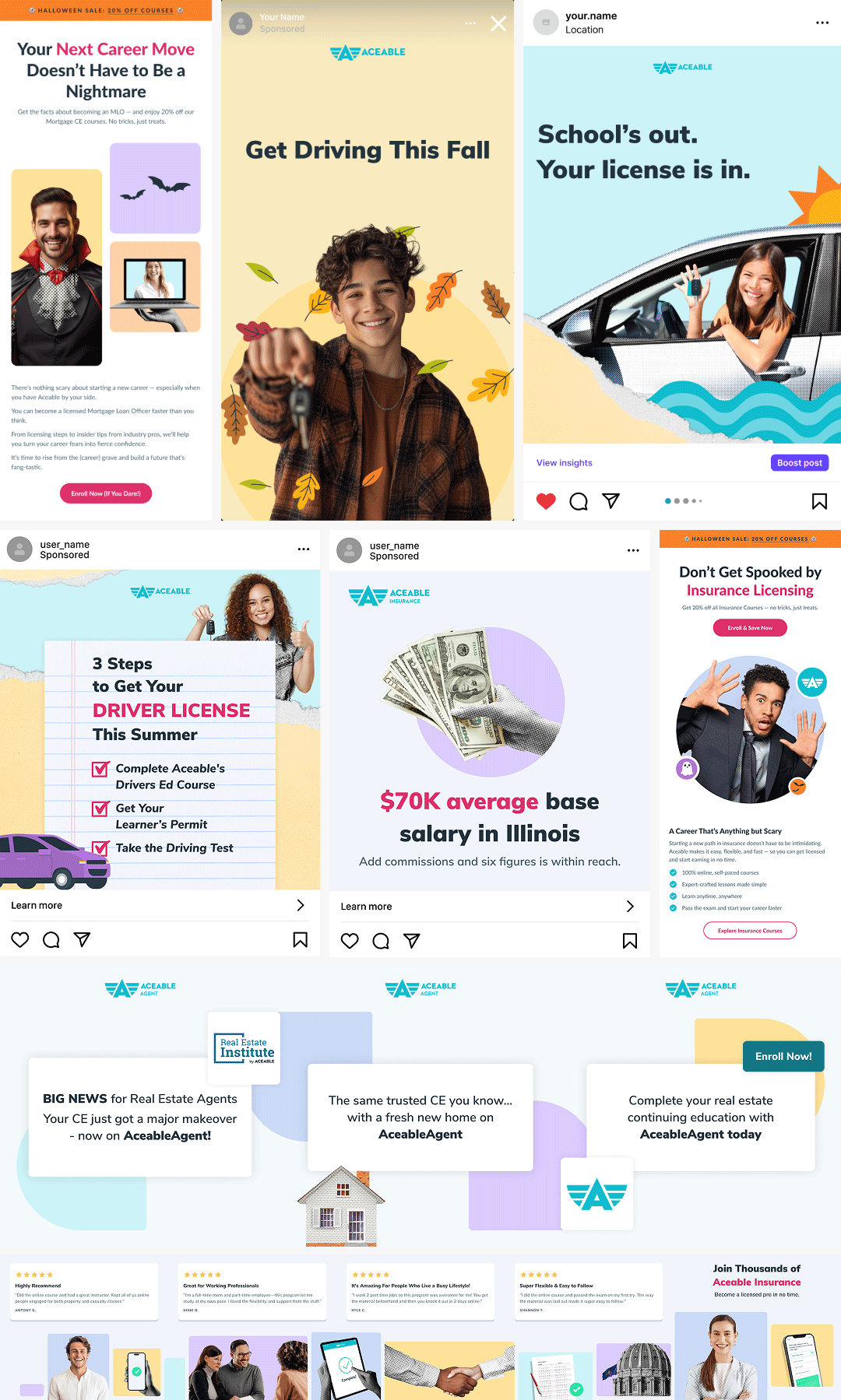
The first Real Estate promo video launched successfully, and the demand for more came quickly. Teen Drivers Ed was next, which made sense since it was Aceable's leading product and the mixed-media style had just proven itself. From there the style carried through as Aceable expanded into Mortgage and Insurance, becoming part of how each new vertical was absorbed into the brand, even adapting its tone to fit products that called for something less playful.
Over time the style grew beyond video and social content. I adapted the visual language for landing pages and email campaigns, developing a set of mixed-media illustrations designed specifically for web layouts. That work eventually led to the CORE Image Library in Figma, a centralized collection of brand imagery that gave marketing, product, and design teams a way to access and deploy consistent visuals independently. The full story of how that system evolved lives in the Creative Systems & Campaign Design case study.
What started as one promotional video became the visual foundation of an entire brand.

Impact
What started as a brief for one promotional video became Aceable's primary visual identity across every marketing channel. The mixed-media style is now used across landing pages, paid and organic social campaigns, CTV advertising, email marketing, and in-course content, and it's been that way since the first campaign launched.
The early results showed stronger engagement and conversion performance compared to previous creative, and internally the response was immediate. Marketing, product, and leadership all aligned around the style quickly, which is how it went from one video to a full brand system in a relatively short time.
Reflection
We didn't set out to define a brand. We set out to make one good promotional video.
Looking back, what made this work wasn't just the visual style. It was that the style was designed to reflect the brand's personality and to be used by a small, fast-moving team. Flexible enough to work across formats, distinctive enough to be recognizable, and simple enough that it didn't require a specialist to execute every time. That's what gave it staying power.
It also taught me something about how visual systems actually get adopted. They have to make people's lives easier, not just look better. The CORE Image Library exists for the same reason the style does, because good design should scale without breaking.