The More You Know

Timeline
2022
Company
Aceable - P&C
Role
Graphics Design, Motion Design, Video Editing
Tools
Illustrator, Photoshop, After Effects, Premiere Pro, Audition
Deliverables
Edited video series with motion graphics, including intros, title cards, and lower thirds
Project Overview
In 2022, Aceable's People & Culture team came to me with an idea for an internal video series that would give the whole company a closer look at each team's daily work, career paths, and the people behind them. They already had a name, The More You Know, and a clear vision for what they wanted it to feel like. My job was to build the creative identity around it and bring every episode to life, from logo and motion graphics through editing and sound design.
The series ran for 8 episodes and lives on Aceable's People & Culture YouTube channel, where it's still used as part of the onboarding process today.
The Challenge
Aceable's People & Culture team wanted to foster stronger connections between departments and help employees understand each other's roles beyond what a job title communicates. Traditional internal communications weren't doing that job, so they envisioned something more human, a short-form interview series where team members could share what they actually do in their own words.
The creative challenge was building a visual identity that felt lively and fun without losing the sense of professionalism the subject matter required. It also needed to feel inclusive across a company with very different kinds of teams, from engineers and data analysts to marketers and instructors.
My Role & Collaboration
I partnered closely with the People & Culture team to shape the creative direction and bring their concept to life. The work covered everything from developing the logo and visual identity to designing motion graphics, editing each episode, and handling sound design.
It was one of those projects where the client came in with a strong instinct for what they wanted and trusted me to figure out how to make it work visually. That's a good dynamic to work in.

The Process
Discovery & Inspiration
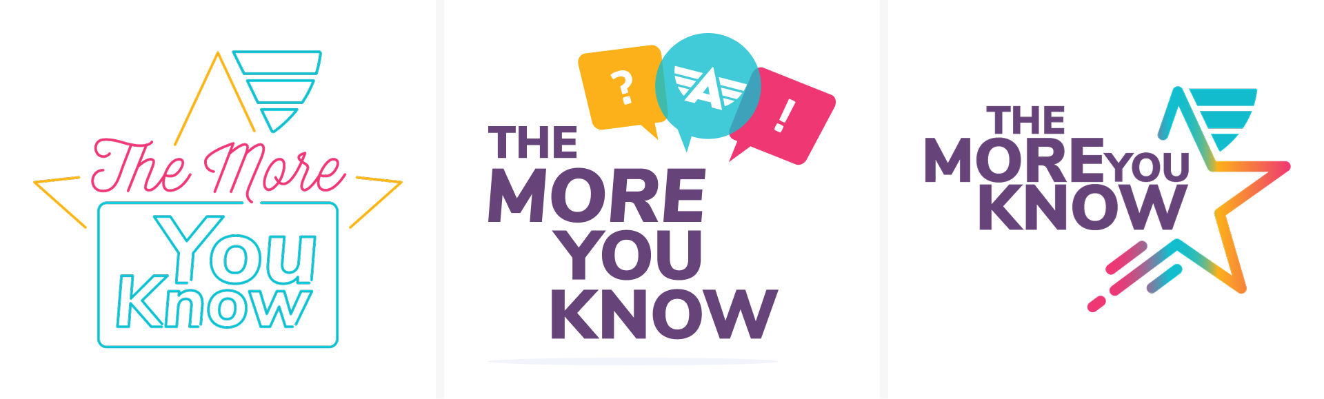
The name The More You Know was a direct reference to the iconic NBC public service announcement campaign, and the P&C team wanted the logo to reflect that. I designed three versions, trying to push the identity somewhere more original, but they chose the one that stayed closest to the source material. As a designer you learn to pick your battles, and honestly it was the right call for what the series needed to feel like.
From there I leaned into the quiz and talent show energy more broadly, experimenting with neon aesthetics and flashcard-inspired visuals before landing on something that merged both. The color palette was built from Aceable's brand colors to keep it connected to the company while still feeling like its own thing.
Workflow & Tools
The visual identity came together in Illustrator and Photoshop, then moved into After Effects for the title animations and motion graphics. Premiere Pro handled the episode editing and Audition the final sound mix.
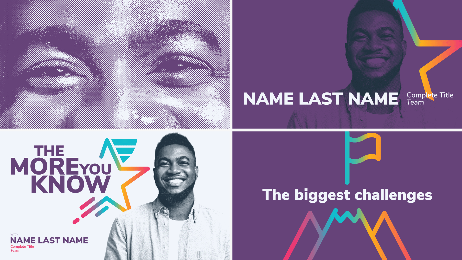
One practical problem came up early: a lot of the employee photos submitted weren't high resolution, which created consistency issues across episodes. I solved it by applying a halftone texture treatment to all the portraits, giving them a cohesive stylized look that also happened to nod back to the retro game show aesthetic. It turned a limitation into part of the visual language.
Tools: Adobe Illustrator, Adobe Photoshop, After Effects, Premiere Pro, Adobe Audition
Iteration & Feedback
The main feedback loop was with the P&C team, refining the tone across the visual identity and the editing approach for each episode. The biggest tension was finding the right balance between playful and professional, I wanted the opening to feel lively enough to be engaging, but grounded enough that employees would take the content seriously.
The glitch transitions in the opening title came out of that same push and pull. I wanted the intro to have a signature move that felt distinct rather than generic, so I experimented until the glitch felt right. It added energy to the title sequence without being distracting, and it set the tone for each episode before the interview even started.
AI Integration

The Solution
The final series featured a dynamic opening title with glitch transitions, halftone portraits, and colorful lower-thirds tied to each employee's department. Each episode opened with an intro screen introducing the featured team members before moving into the interview itself. The editing stayed simple and authentic, letting the conversations take center stage while the graphics added rhythm and visual energy around them.
Eight episodes, eight teams, one consistent visual language that made every person on screen feel like they belonged to the same show.

Impact
The More You Know was a success internally. Employees loved seeing their peers talk about their work in their own words, and the series opened up conversations across departments that wouldn't have happened otherwise.
The first episode stuck with me personally. It featured the data management team, and I went in assuming it would be the driest subject matter of the bunch. By the end I had learned what Power BI was, understood why data management is critical to how the company runs, and completely changed my assumptions about what that team does. If the series could do that to the person who made it, it was doing its job.
All eight episodes are still available on Aceable's People & Culture YouTube channel and continue to be used as part of the onboarding process today.
Reflection
This project was a good reminder that good design doesn't always have to face outward. Some of the most meaningful work can happen internally, connecting people who already share a building or a Slack channel but don't really know what each other does.
The More You Know gave employees a voice and gave the rest of the company a reason to listen. That's a simple idea, but watching it actually work made it one of the projects I'm most quietly proud of.