Villa Lobos: Cantigas & Crianças

Timeline
2024
Company
Caseiras Produções Culturais
Role
Visual Identity, Art Direction, Illustration, Graphics Design
Tools
Illustrator, Photoshop, After Effects, Premiere Pro
Deliverables
Stage illustrations, posters, social media assets, digital program, sales deck
Project Overview
Villa-Lobos: Cantigas & Crianças is a children's theatre production by the Brazilian musical group Orquestra Villa-Lobos, celebrating the cantigas de roda, traditional Brazilian songs that most kids who grew up in Brazil know by heart. I was one of them.

I was invited by Caseiras Produções to create the visual identity for the production, including illustrations, stage projections, and promotional materials. The goal was to build a colorful visual world that felt joyful and playful for children while evoking nostalgia for the parents in the audience who grew up singing the same songs.
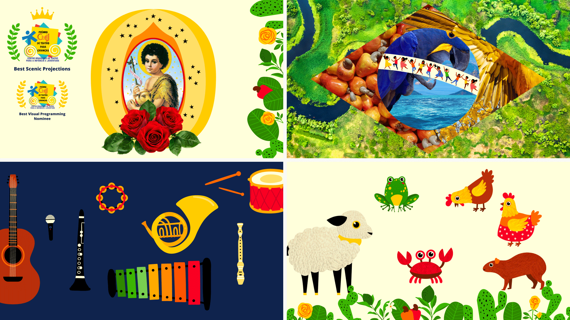
The production went on to win Best Scenic Projections at the Prêmio CBTIJ de Teatro para Crianças in 2025, one of Brazil's most prestigious theatre awards for children's productions.
The Challenge
The creative direction was inspired by Brazilian Naïf painting, a folk art style known for flat compositions, bright colors, and expressive illustrations of everyday life. It was the perfect visual reference for the project, but translating a handcrafted, detail-rich style into a digital system that could work across posters, social media, and live stage projections was its own challenge.
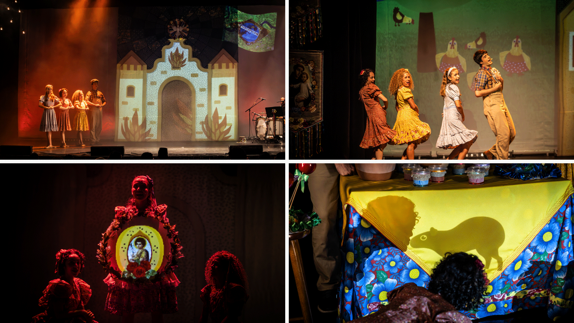
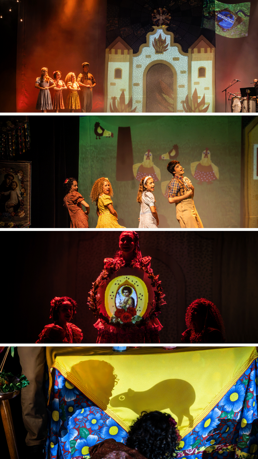
The projections especially required careful thinking. They needed to be expressive enough to add to the storytelling while remaining clear and readable alongside the actors on stage. In some moments they would create immersive environments around the performers. In others they would interact directly with objects the actors were physically touching, like drums and tablecloths. That kind of integration doesn't leave much room for error.
The collaboration also happened remotely, with the production team based in Brazil while I was working from Austin. Three hours apart doesn't sound like much, but it meant early morning calls, occasional weekend check-ins, and learning to communicate clearly across time zones and tools.
My Role & Collaboration
I led the visual identity, illustration, and art direction for the project, working closely with the director and creative team from concept through delivery.
Once the illustration style was established, I collaborated with the animation team responsible for bringing the projections to life on stage. I created layered artwork and separate visual elements designed specifically for animation, and provided creative direction to make sure the projected scenes felt aligned with the tone and emotion of each song. Since the orchestra performed live, the final synchronization between projections and music happened in real time on stage, that part was in the animation team's hands.
Most of the heavy collaboration happened at the beginning. Once the visual identity was locked in, communication shifted to emails and messages, which worked well for a remote project at that stage. The foundation was solid enough that the team could move forward confidently without constant back and forth.

The Process
Discovery & Inspiration
The director shared a few initial references to get things started, which I used as a jumping off point to explore Brazilian Naïf art more broadly. I studied compositions, color palettes, and the traditional cultural symbols that show up in that style, rural landscapes, animals, local architecture, everyday life.
What I loved about Naïf painting is its simplicity. Flat geometry, symmetrical compositions, bright colors, minimal perspective. It has a warmth and directness that felt exactly right for a production about childhood songs. My goal was to preserve that quality while adapting it into something that would read clearly on a stage and scale across digital formats.
The characters came naturally. Most of the cantigas de roda have their own main character, an animal, a person, an object, and those characters are what children connect with most. I already had a childhood version of most of them in my head from growing up with these songs. Getting to finally draw them was one of the best parts of this project.
Workflow & Tools
The illustrations were built entirely in Adobe Illustrator, where I did all the drawing, composition, and color work. I started by sketching directly in the app, combining reference elements and refining shapes digitally. To keep the style cohesive across a large number of characters and scenes, I worked with a limited color palette and simple geometric forms inspired by Naïf painting.
Later in the process, the animation team asked for additional texture on some of the animal characters. I added subtle fur details and surface textures in Photoshop to give them more warmth and dimension while keeping the flat illustrative style intact.
For the stage projections, I delivered layered assets with separated elements so the animation team had the flexibility they needed to build scenes and movement on their end.
Tools: Adobe Illustrator, Adobe Photoshop
Iteration & Feedback
The visual direction evolved through ongoing conversations with the director. We refined color balance, character proportions, and textures over multiple rounds until the illustrations matched the emotional tone of each song.
The remote setup meant most feedback came through messages and calls, which required clear visual communication on my end. I learned to present work in context early, showing how characters and scenes would sit together rather than sharing isolated elements, so the director could react to the full picture rather than individual pieces.
Working with the animation team added another feedback loop. They would flag practical things I couldn't always anticipate from my side, like how certain colors read under stage lighting or how much detail was too much for a projection at distance. That input shaped some of the final illustration decisions more than I expected.
AI Integration

The Solution
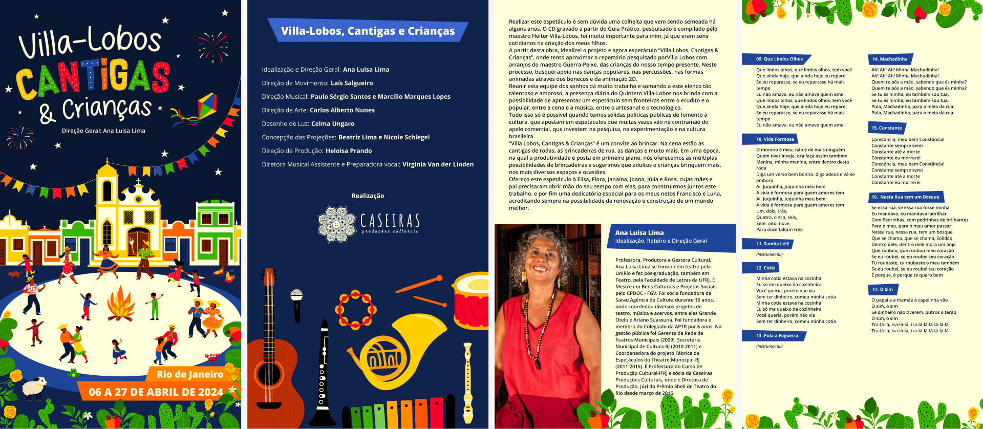
The final visual identity combined Brazilian folk art with modern digital illustration, applied across posters, social media graphics, a sales presentation, and a vertical digital program accessible through a QR code during performances.
The stage projections became one of the most memorable elements of the production. They created immersive environments around the performers and in some moments interacted directly with objects the actors were physically using on stage, like drums and tablecloths, making the illustrations feel alive in the space rather than just decorative.
Impact
Villa-Lobos: Cantigas & Crianças received national recognition at the Prêmio CBTIJ de Teatro para Crianças in 2025, one of Brazil's most prestigious theatre awards for children's productions. The production won Best Scenic Projections and was nominated for Best Visual Programming.
It was the first time I had work recognized at that level, and it came from a project that started as a personal invitation from a small production company in Brazil. That contrast still means a lot to me.
Reflection
Villa-Lobos: Cantigas & Crianças was one of the most meaningful projects I've worked on. Not just because of the creative freedom it offered, but because the work felt personal in a way that most projects don't.
Growing up in Brazil, these songs were just part of life. I didn't expect that years later, living in a different country and working as a designer, I'd get to build the visual world around them. That's the kind of project that reminds you why you chose this path.